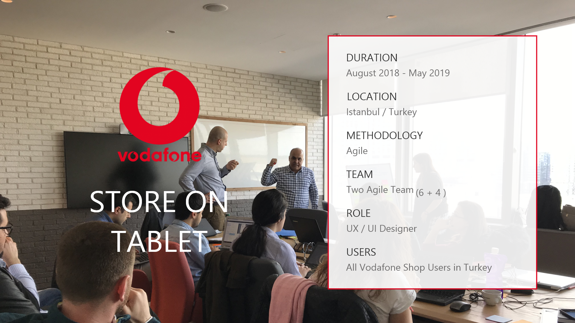

There is a quite vast list of projects that I have worked on since I started my UX / UI career. Vodafone is the world brand and one of the biggest three GSM / TELCO companies in Turkey. They've a thousands shop / stores and thousands users. They have been using old, very old desktop applicaitons in many channels and customer touch points. They decided to use responsive mobile tablet application for end to end customer journey mobile transactions untill the customer comes through exit from store. Includes biometric sign. No paper, no desktop app, no more step. Actually, this was a very big digital transformation project. They asked POC presentation that especially they have wanted to UX / CX and Service Design strategical concept effect. I made it and they've very liked and we got job.


Vodafone's Strore / Shop users had to use a lot of applications that are not usable, useful, accessable, redable and not resonsive. Complex menu navigation and thousands pages. And bored customers are waiting. We had to design simple web tablet app. for all mobile transactions. They wanted to use same technical architecture and web / middle / micro services. But, we had to change all cutomer journey and service design process steps and components, elements and navigation. So, all service input parameters and outputs had to been reviewed. We have one Product Owner and we don't have a Business Analyst. UX Research is not enough for this process. Because, it was not web portal or mini app. It'a all mobile transaction CRM tool. At the point, my business analayse and TELCO experience has become very important. It was challenge for all of us. And we've started.
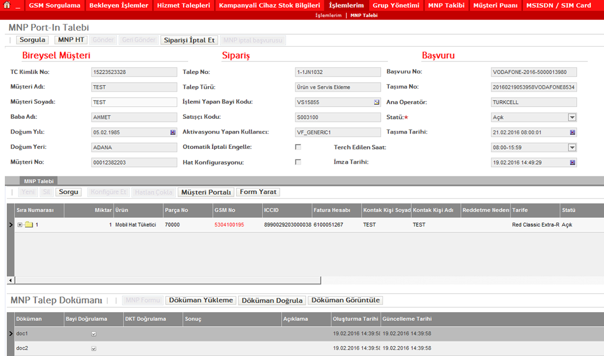
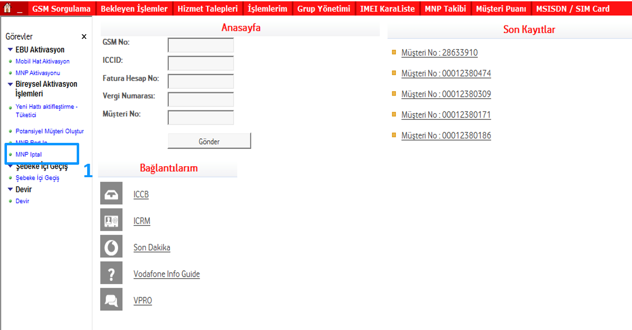
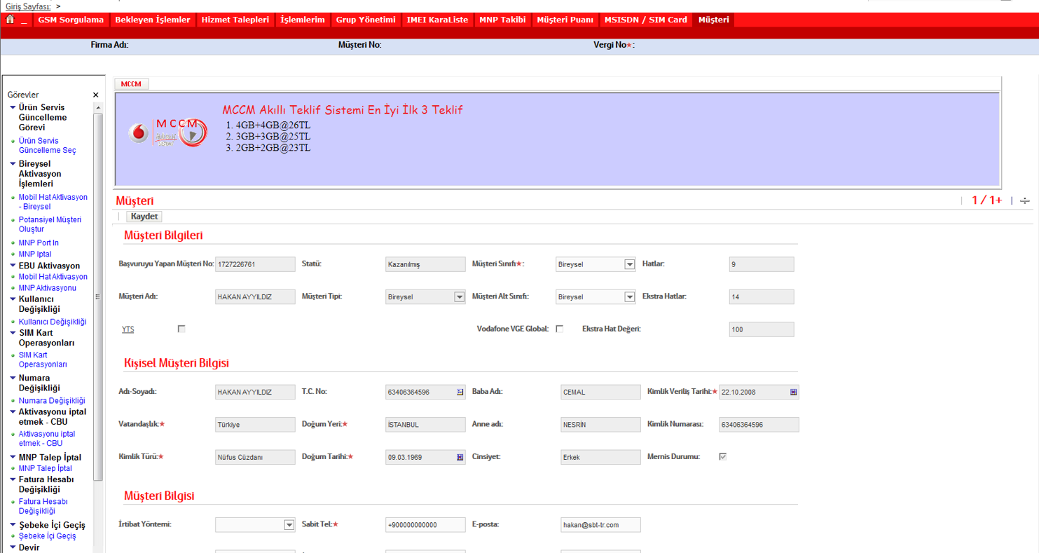
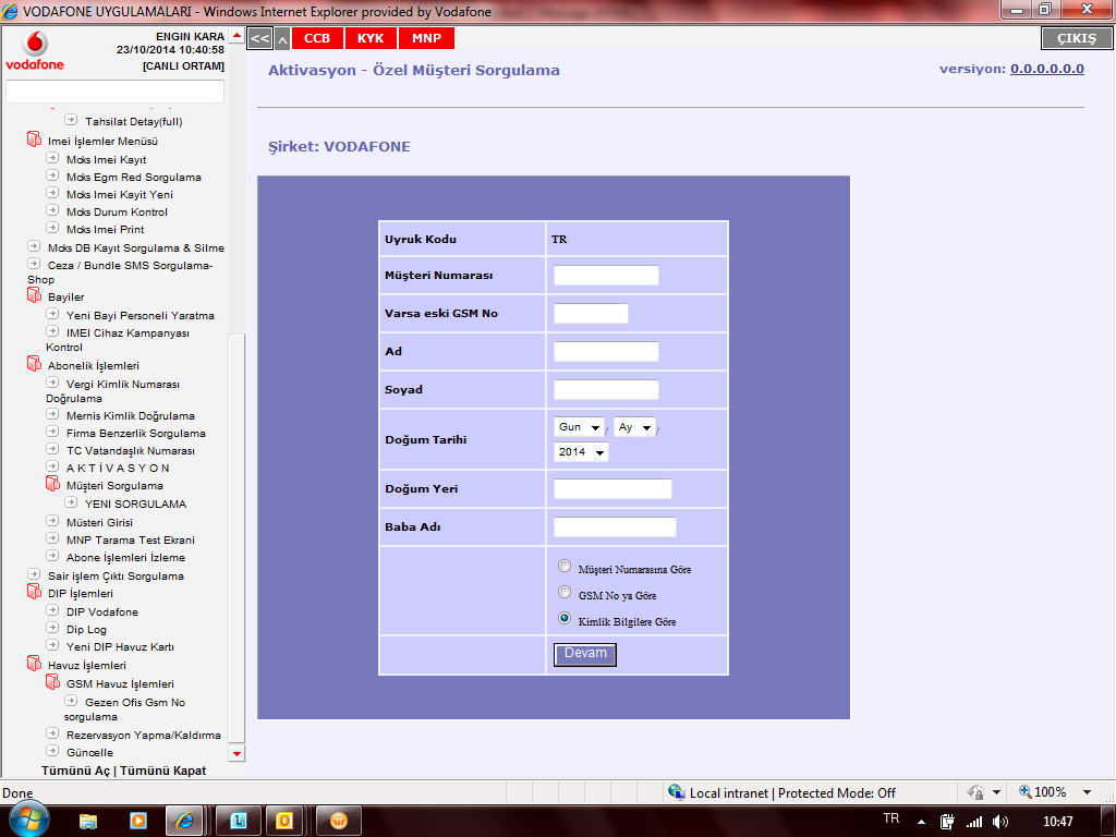
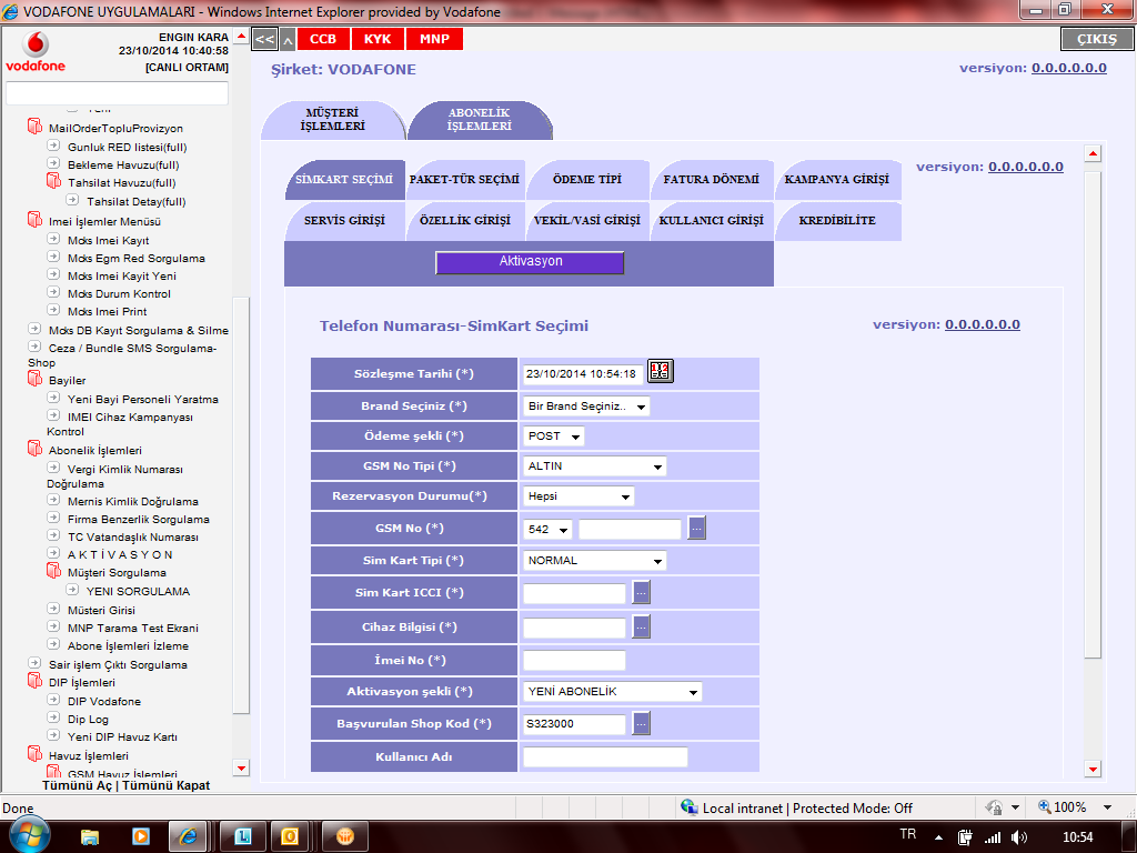
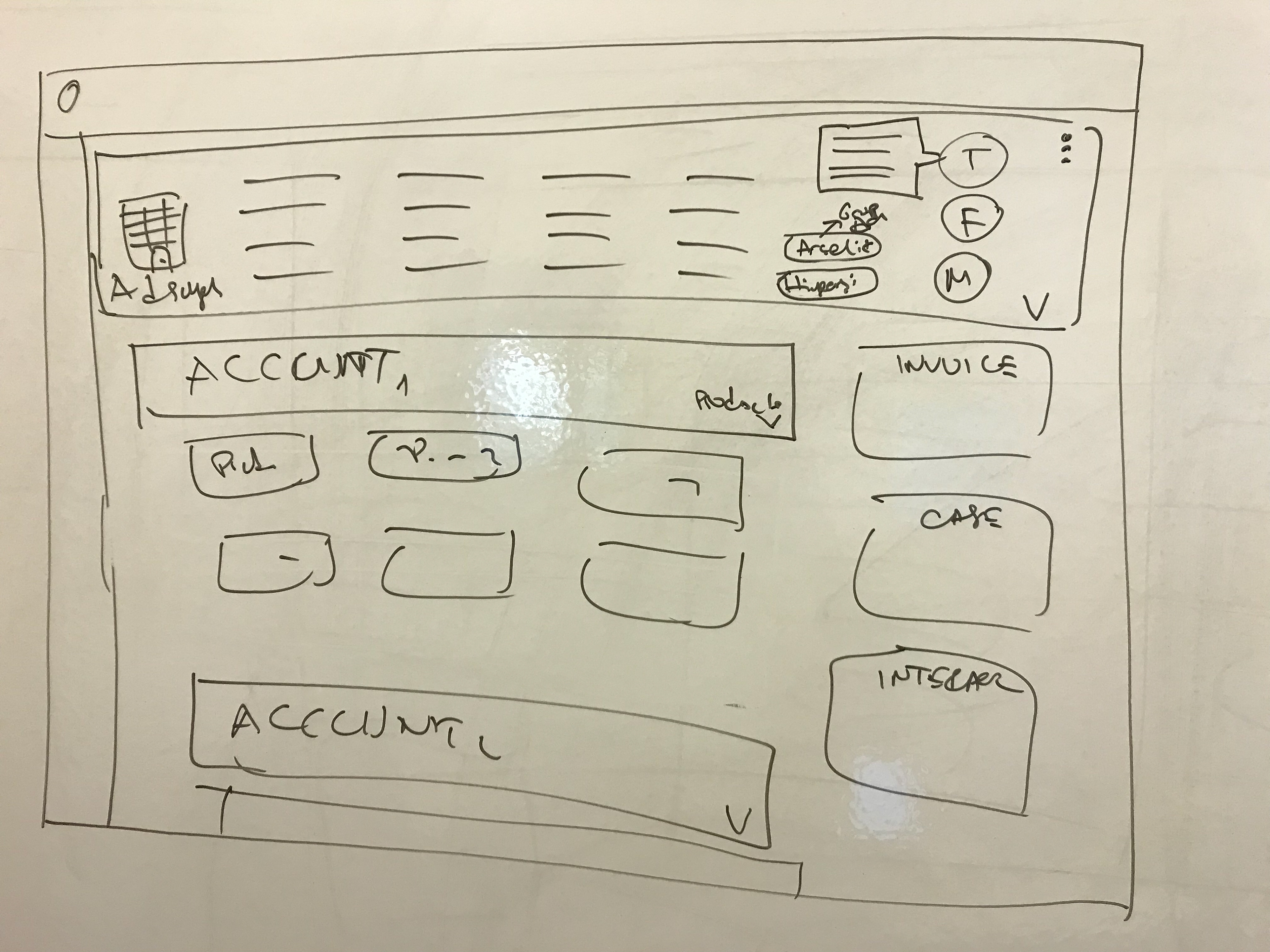
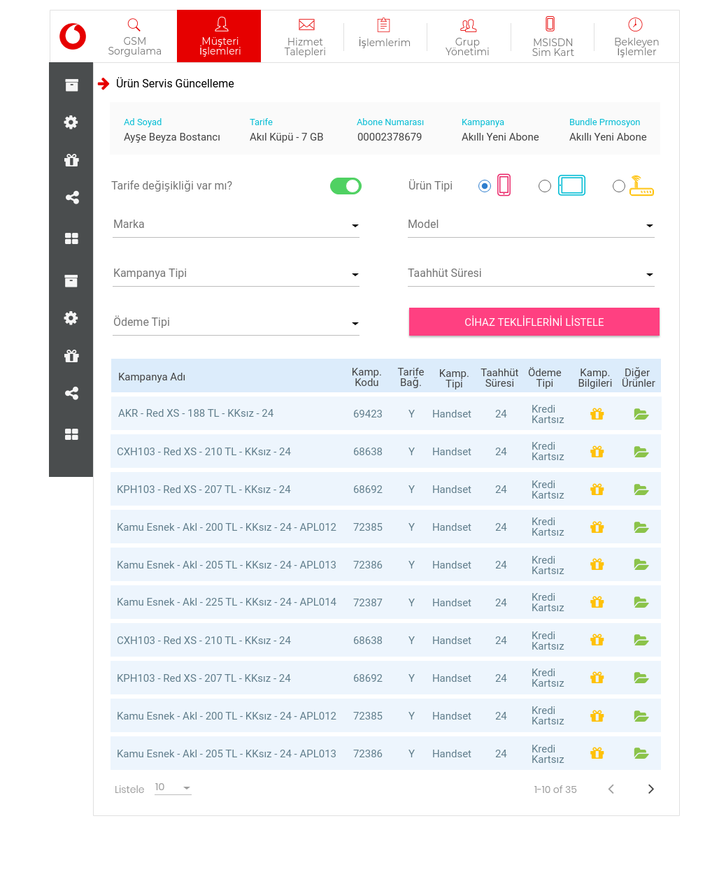
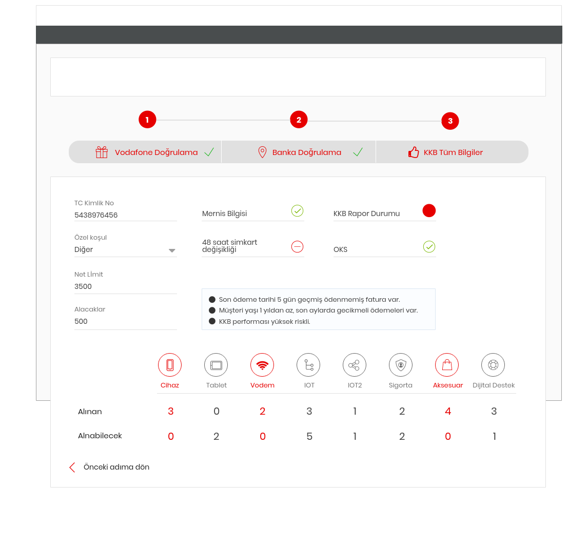
Some as is UI;

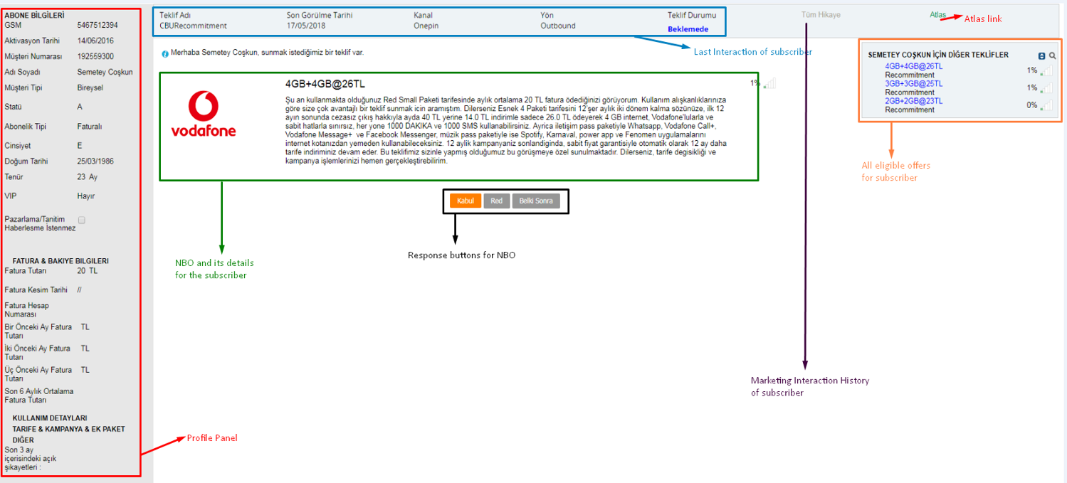

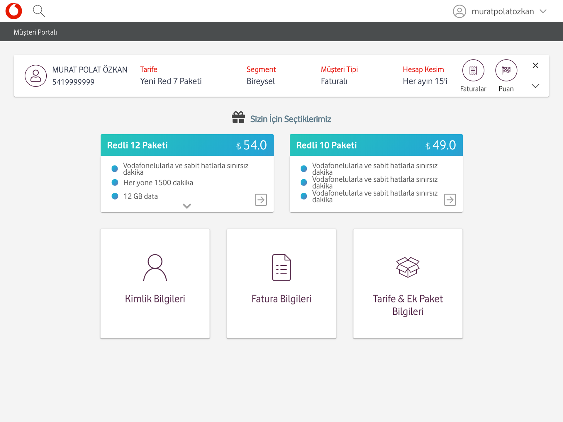
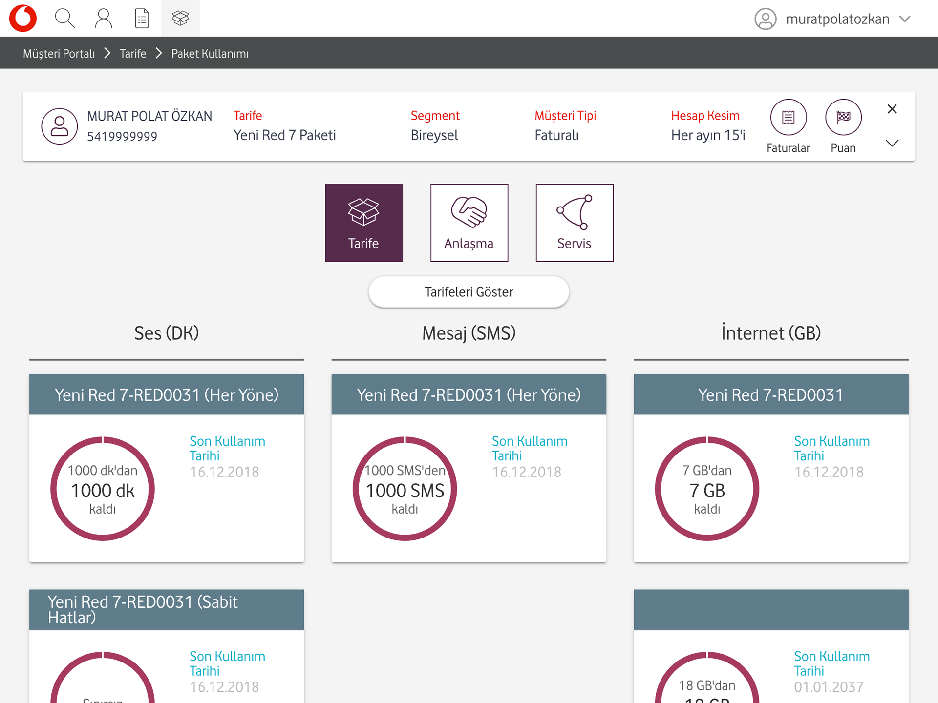
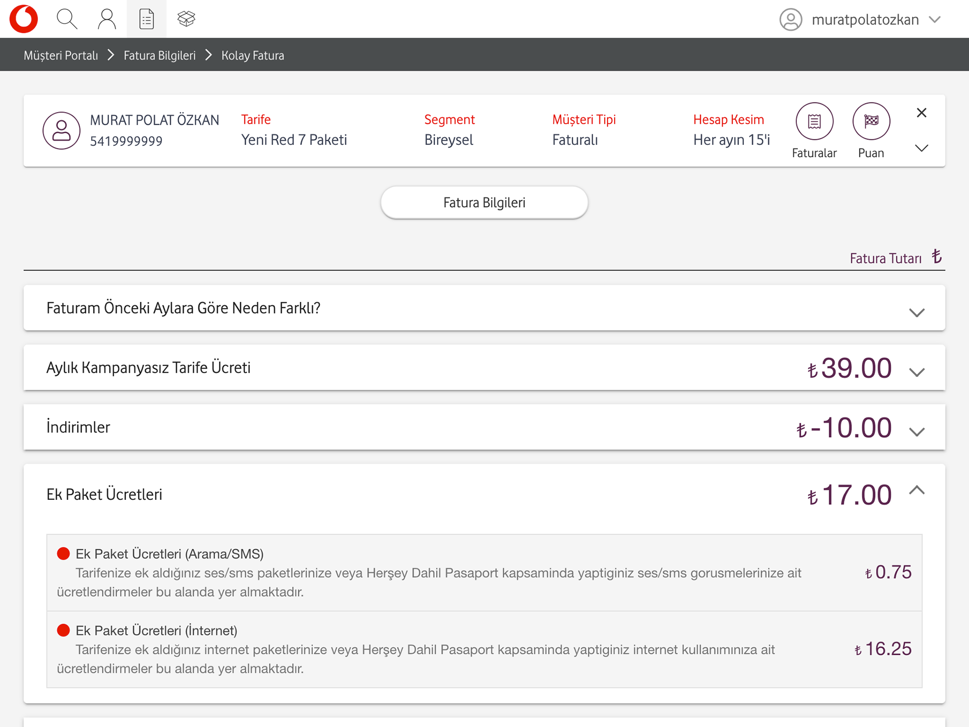
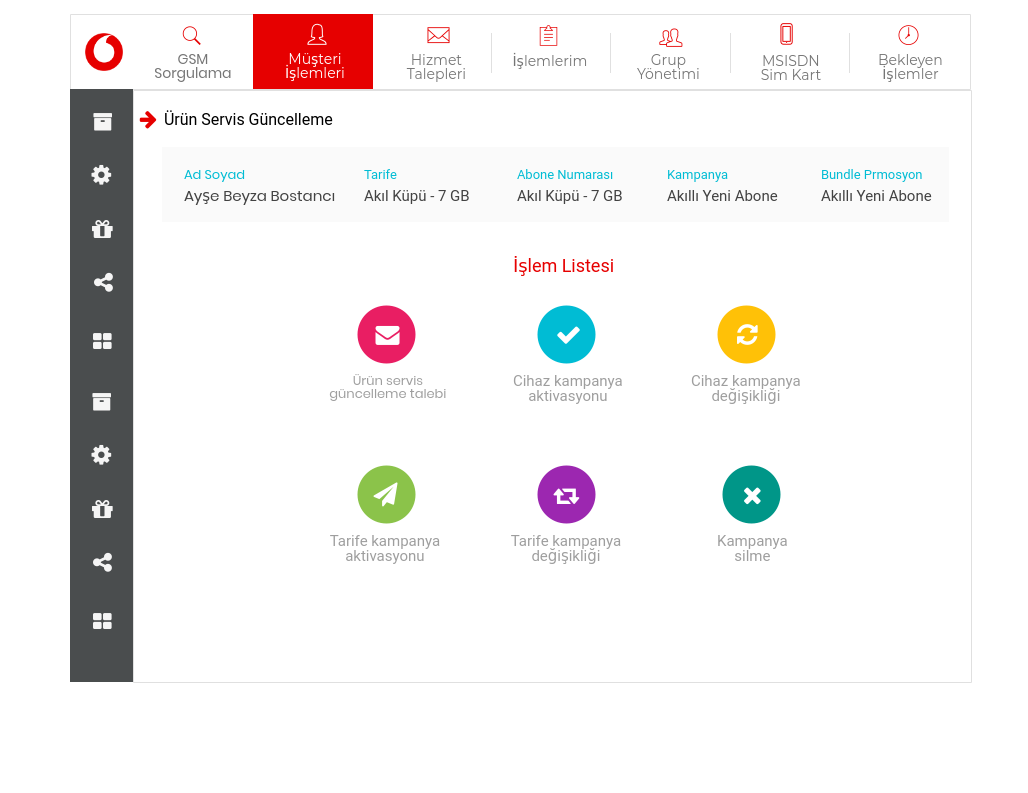
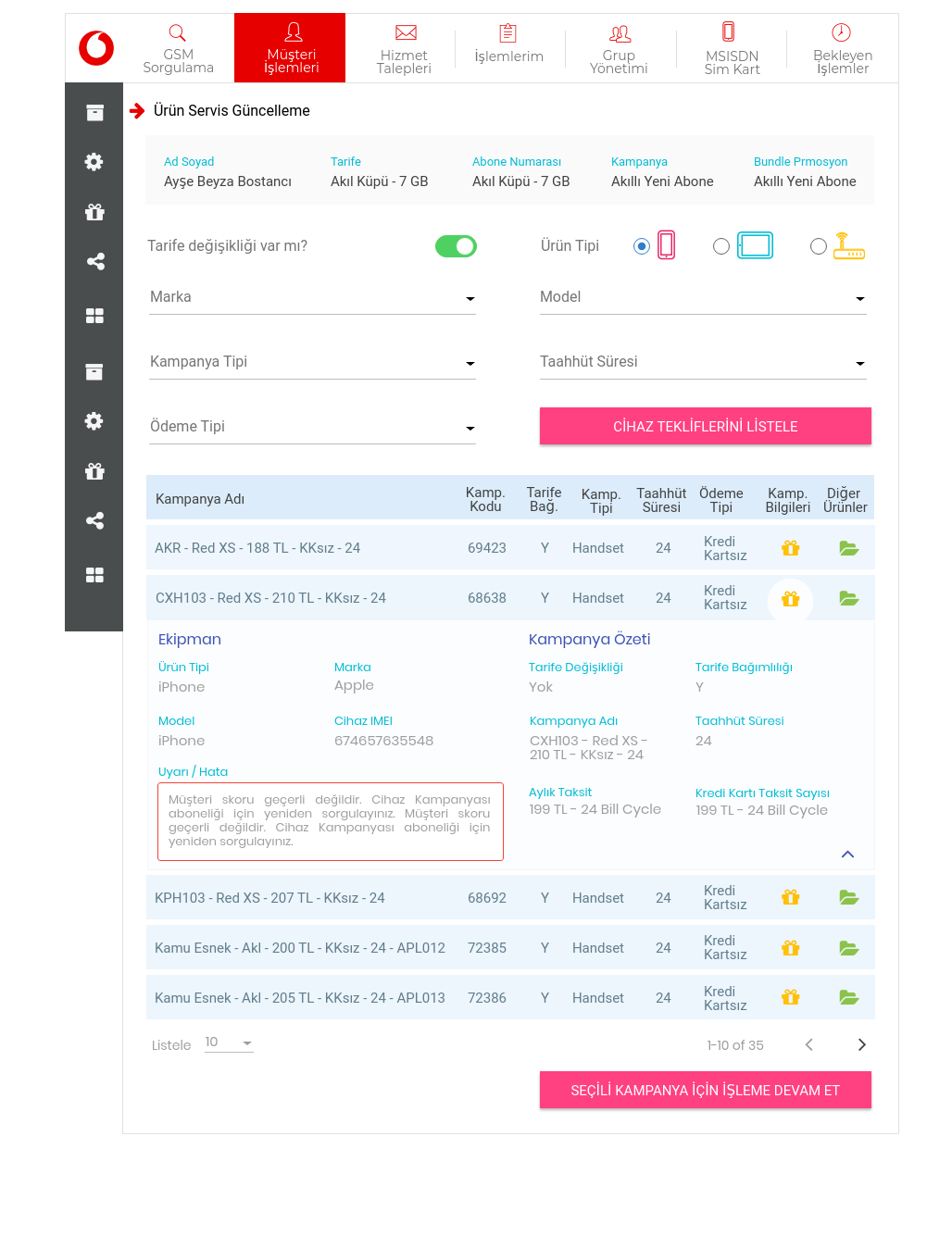
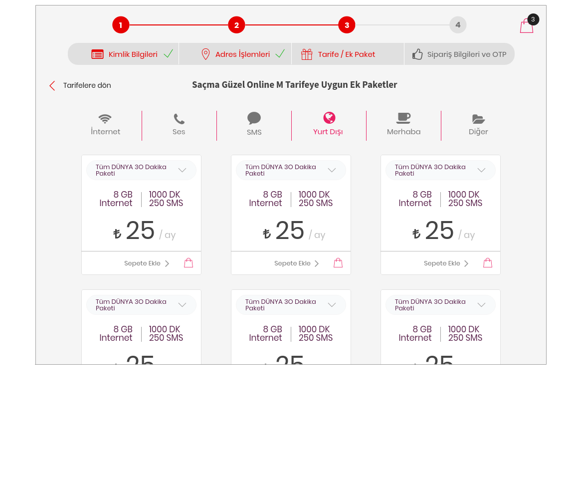
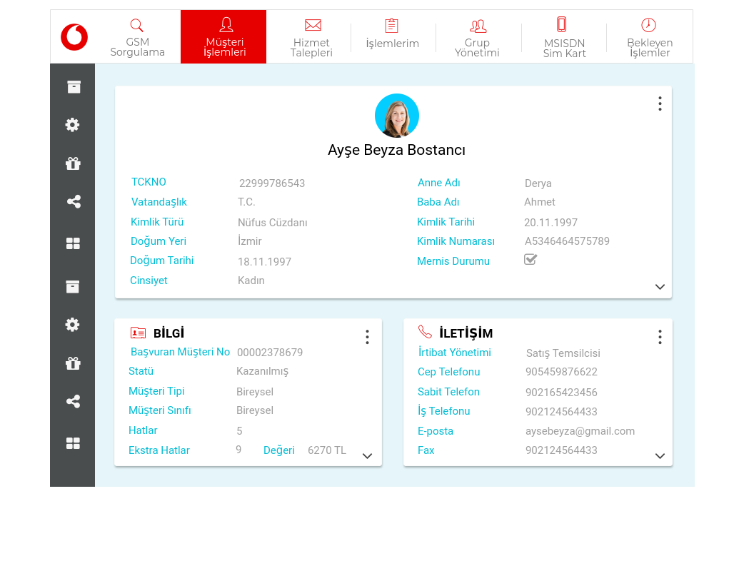
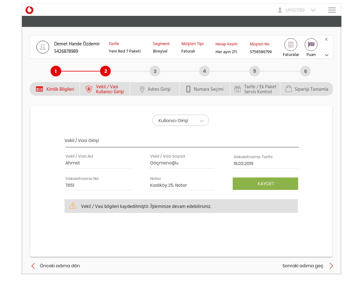
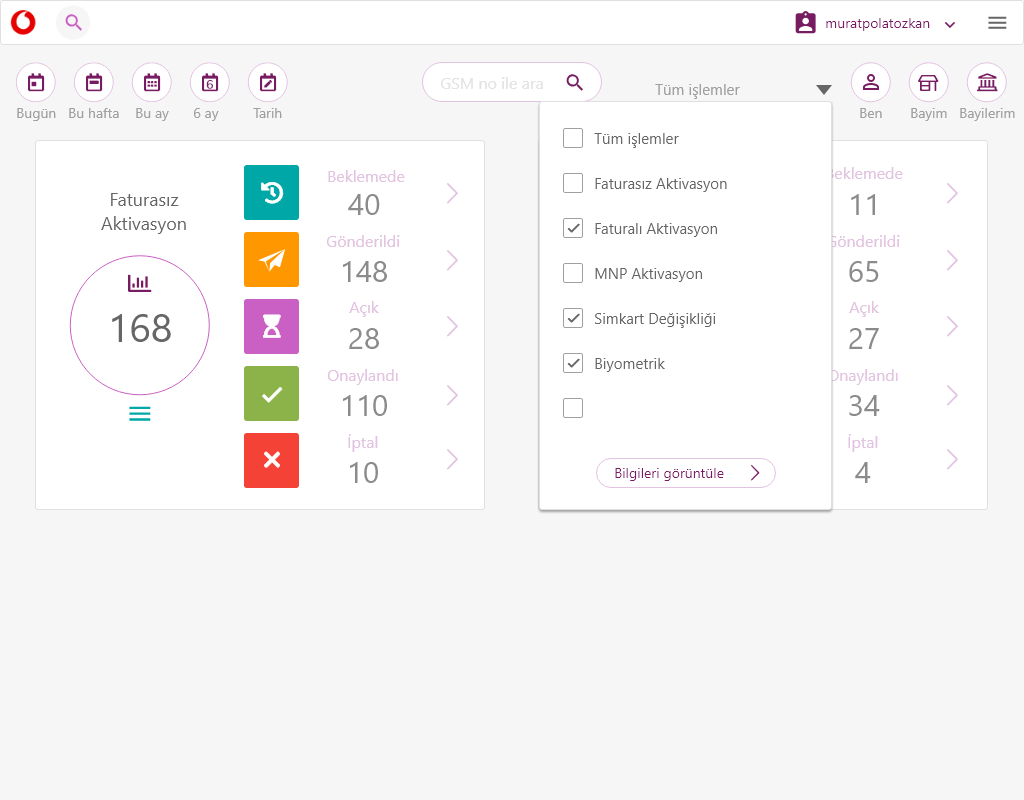
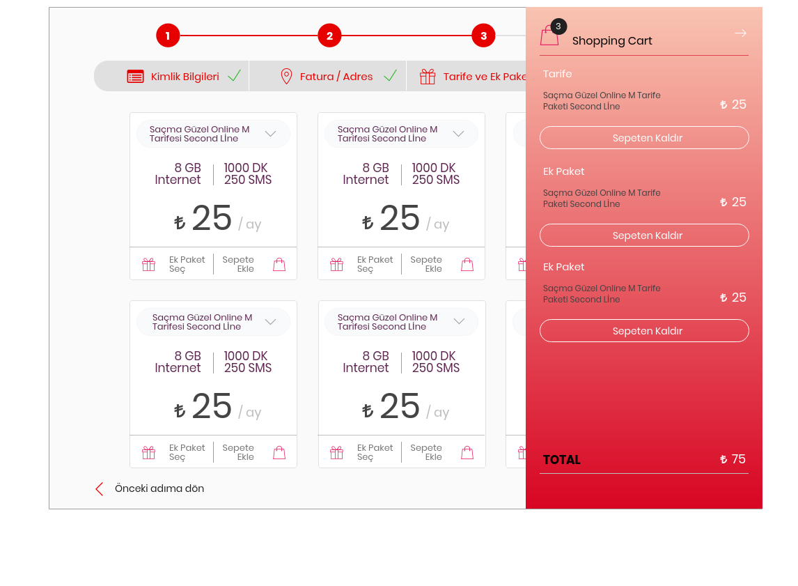
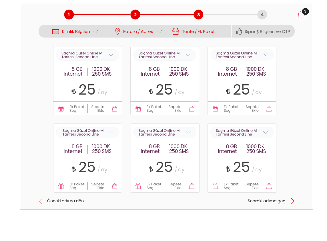
We have decided to quick MVP concept for priority transactions.User login, customer login and verification, customer header & card all detais.We've designed quick access menu and header icon menu. Users have not to reach main menu, always. It's very important same process menu items to be in same UI. For example; invoice > last 6 invoice deatils > easy invoice items explanation > invoice adress. And layout design would be responsive and all user flow would be use with same experience. My UX design process is;
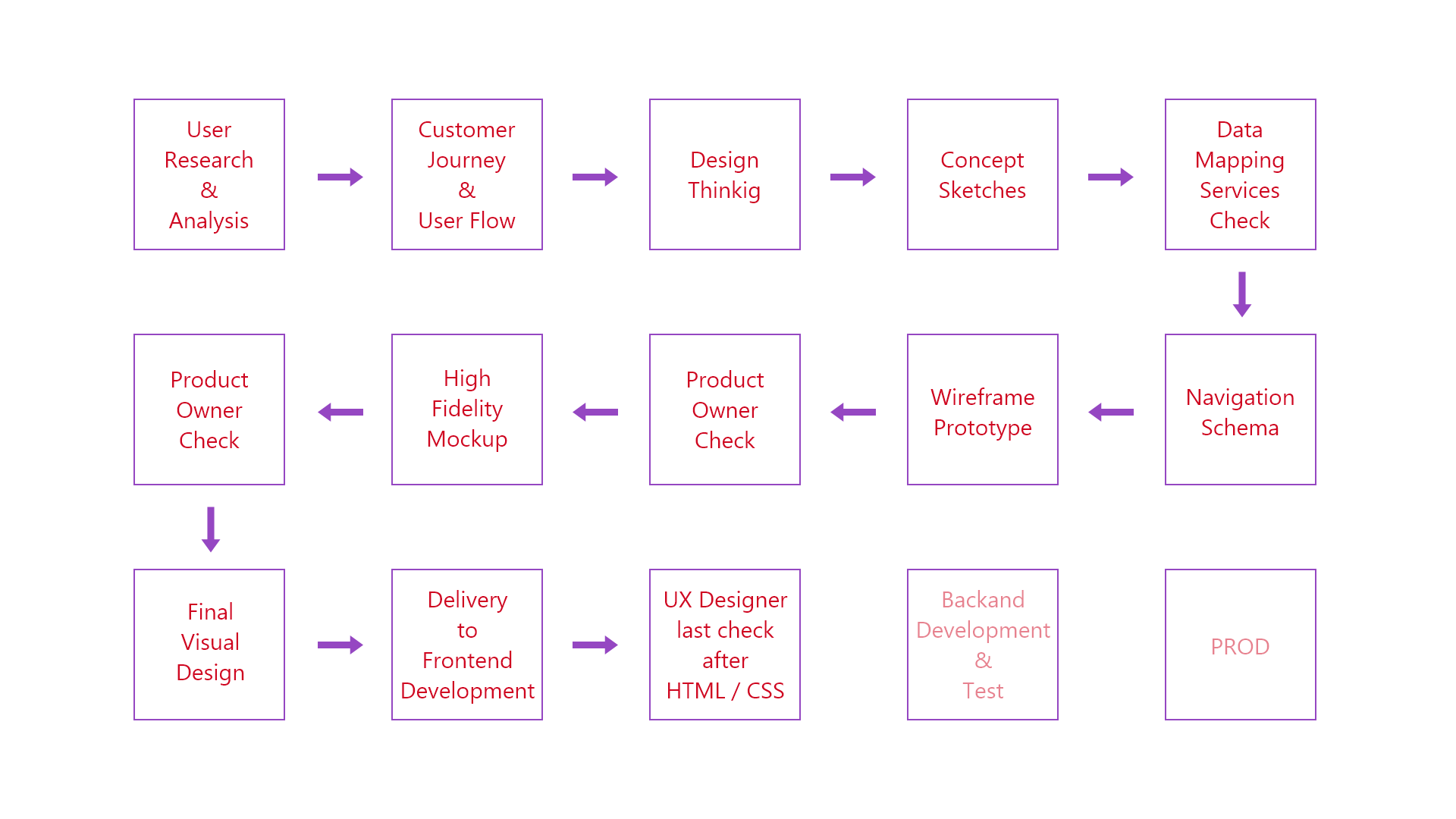

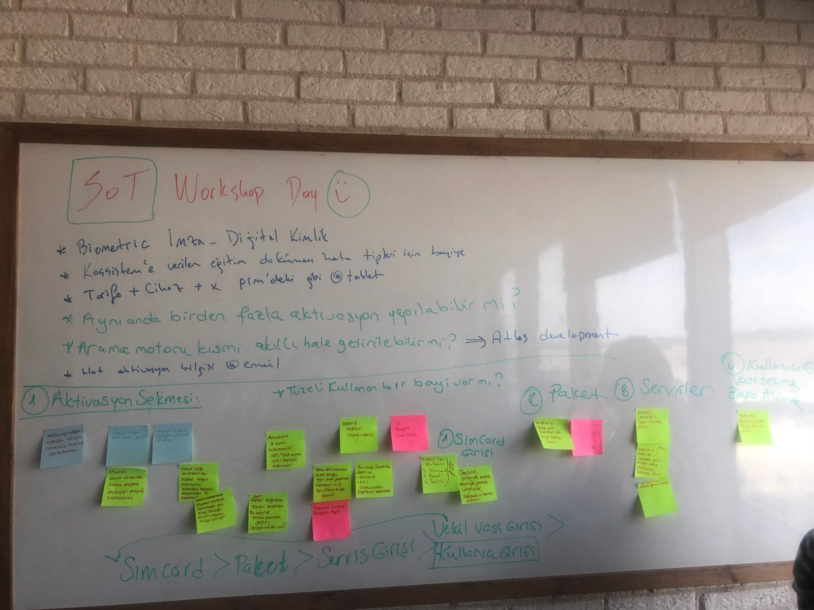
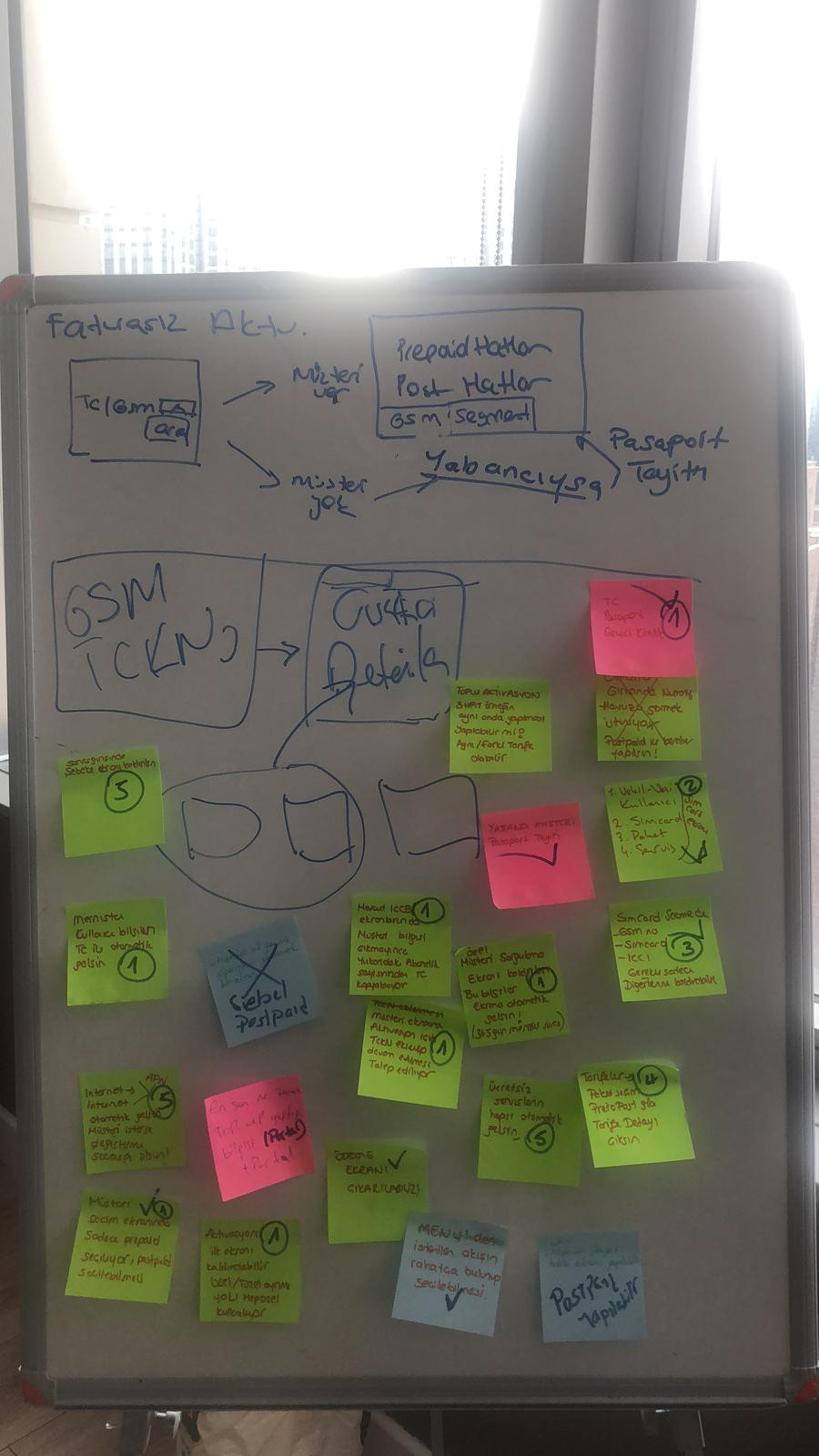
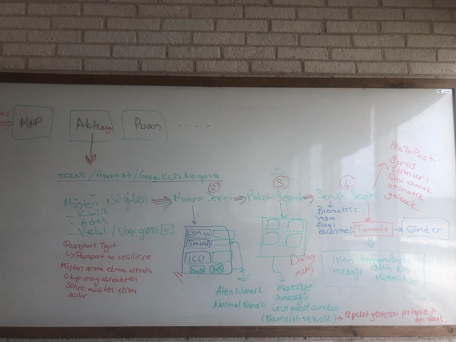
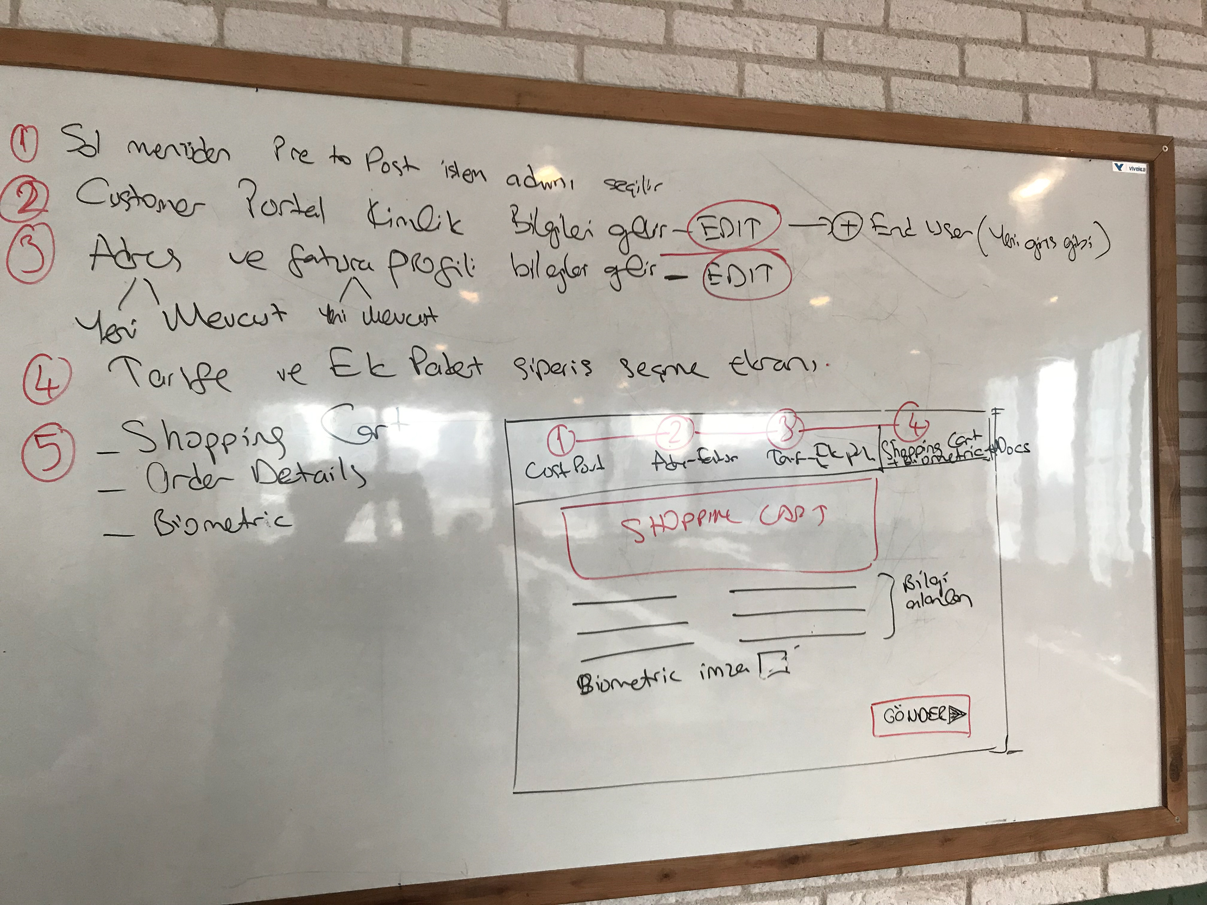
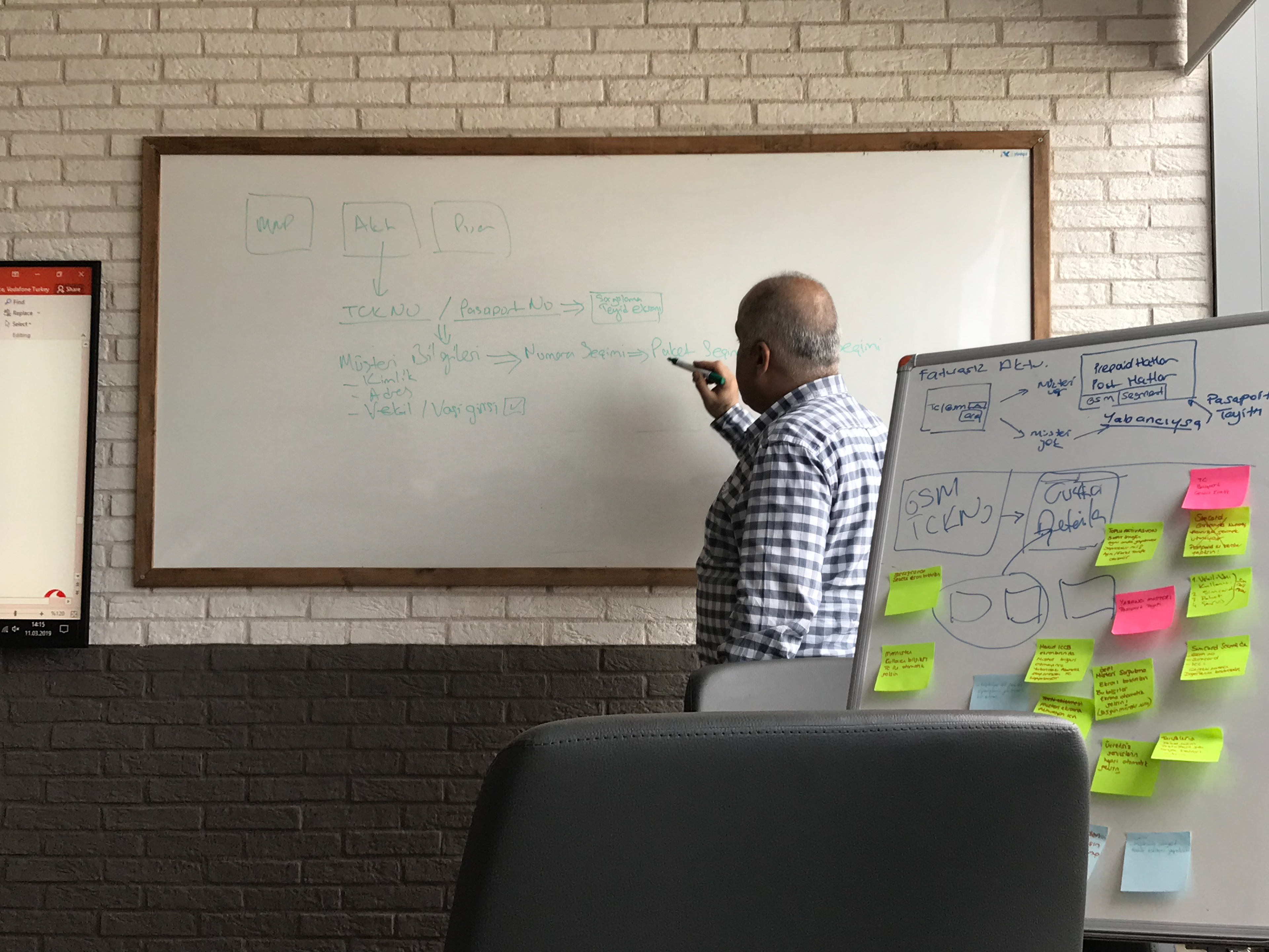
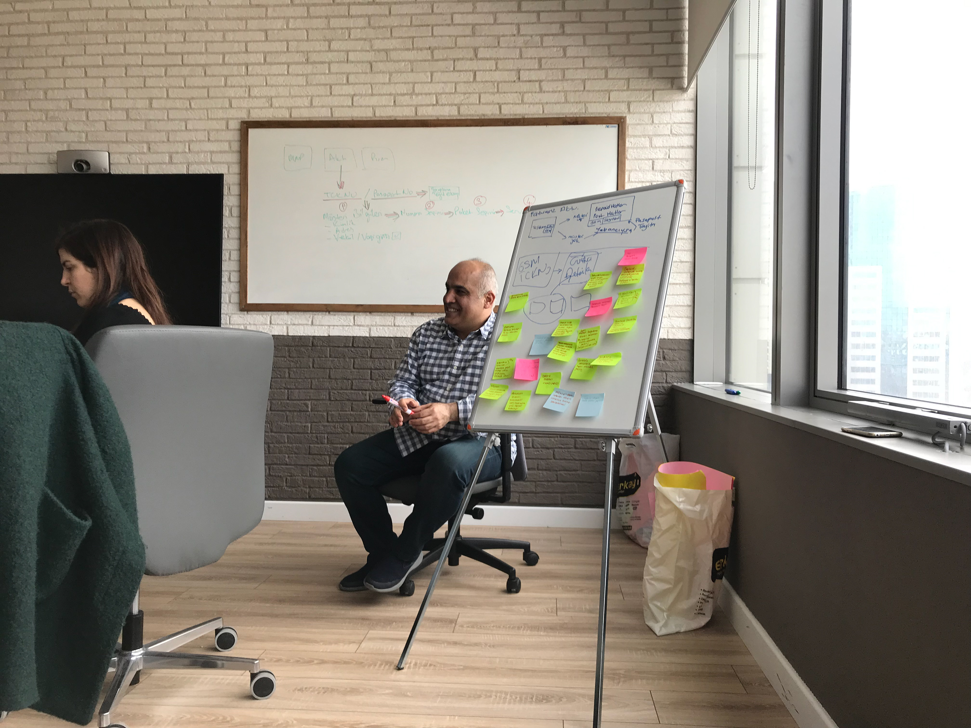
Some Design Thinking Workhop sketch design, user flow and process analyse notes;
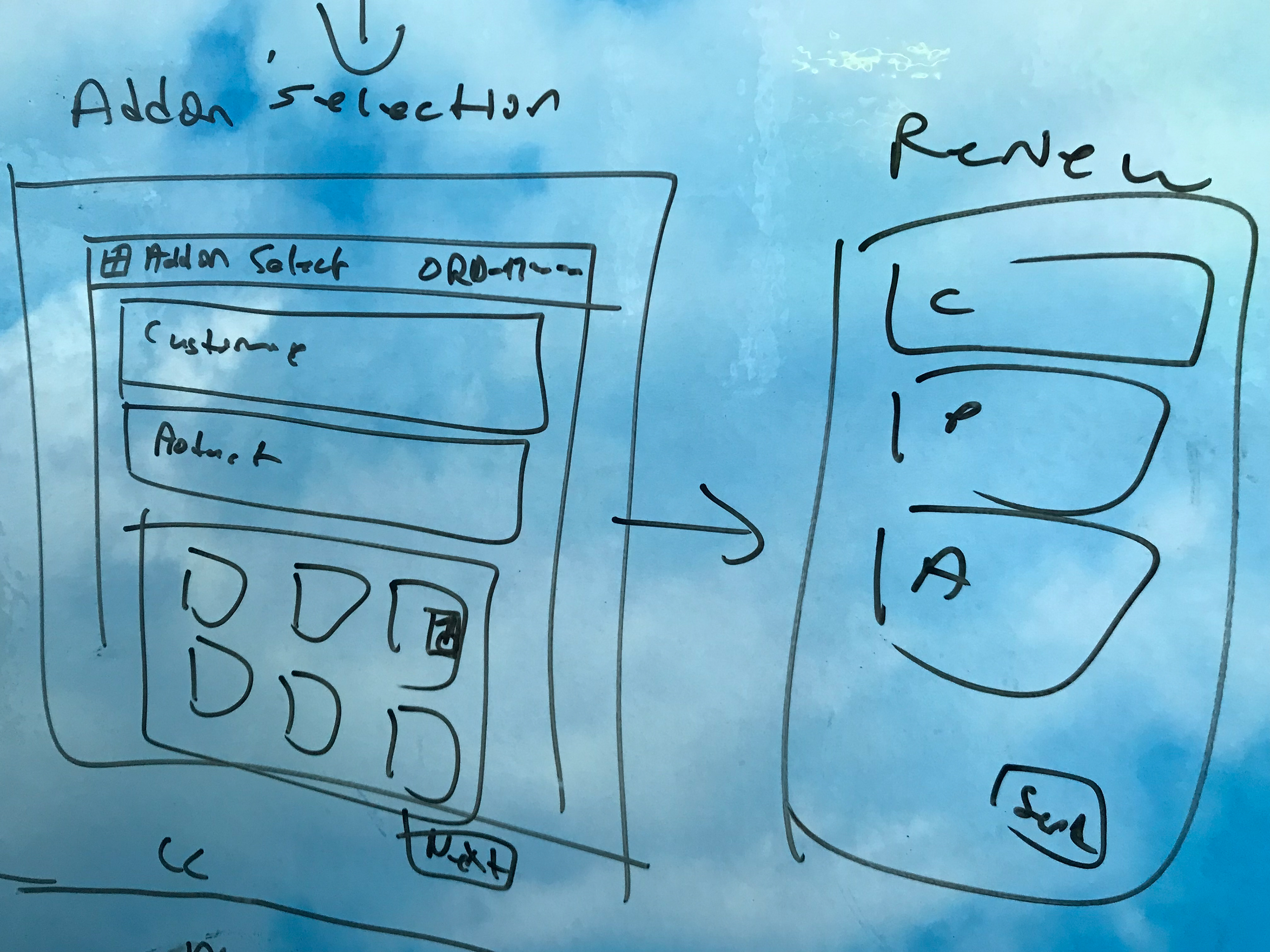
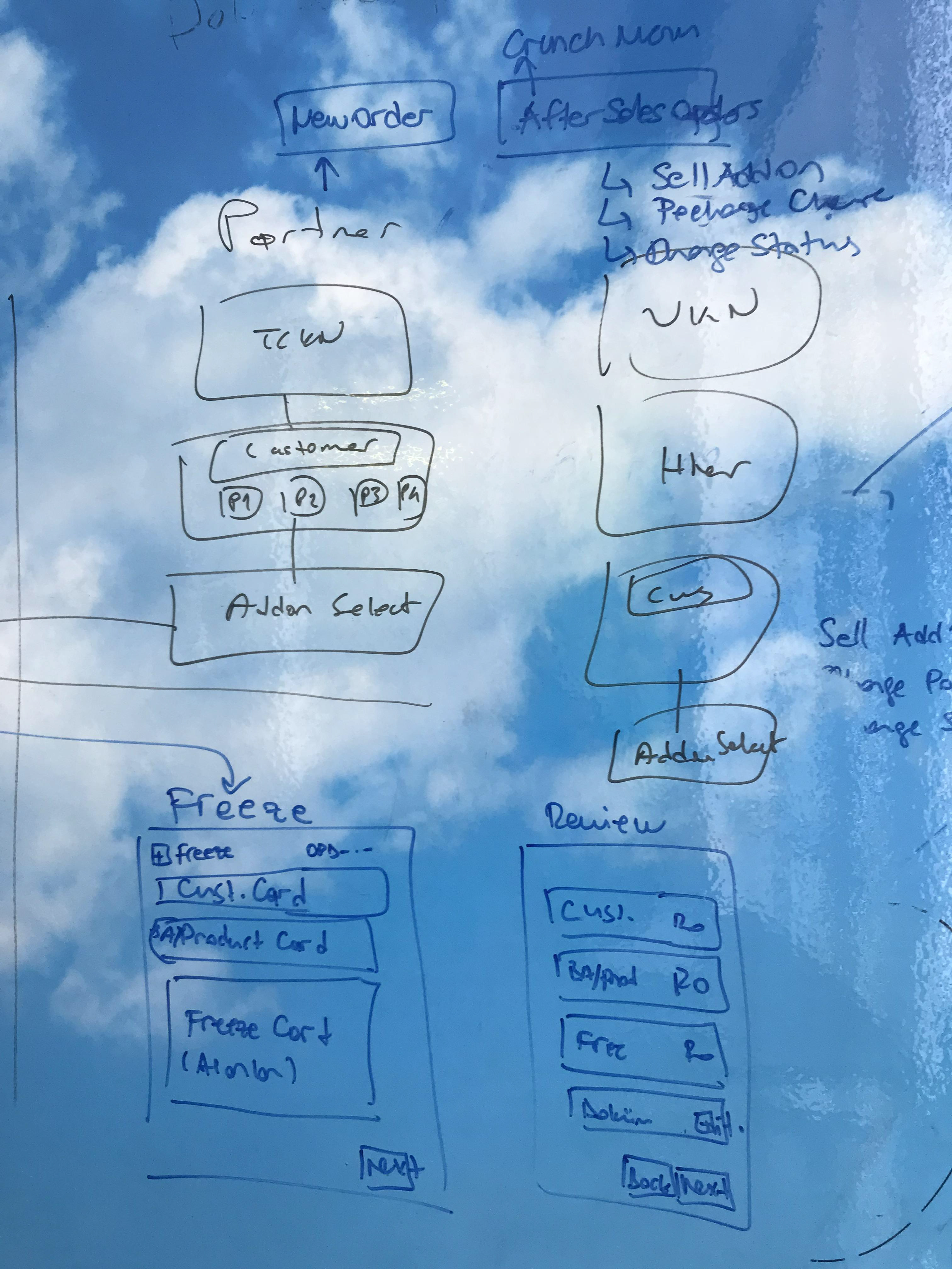
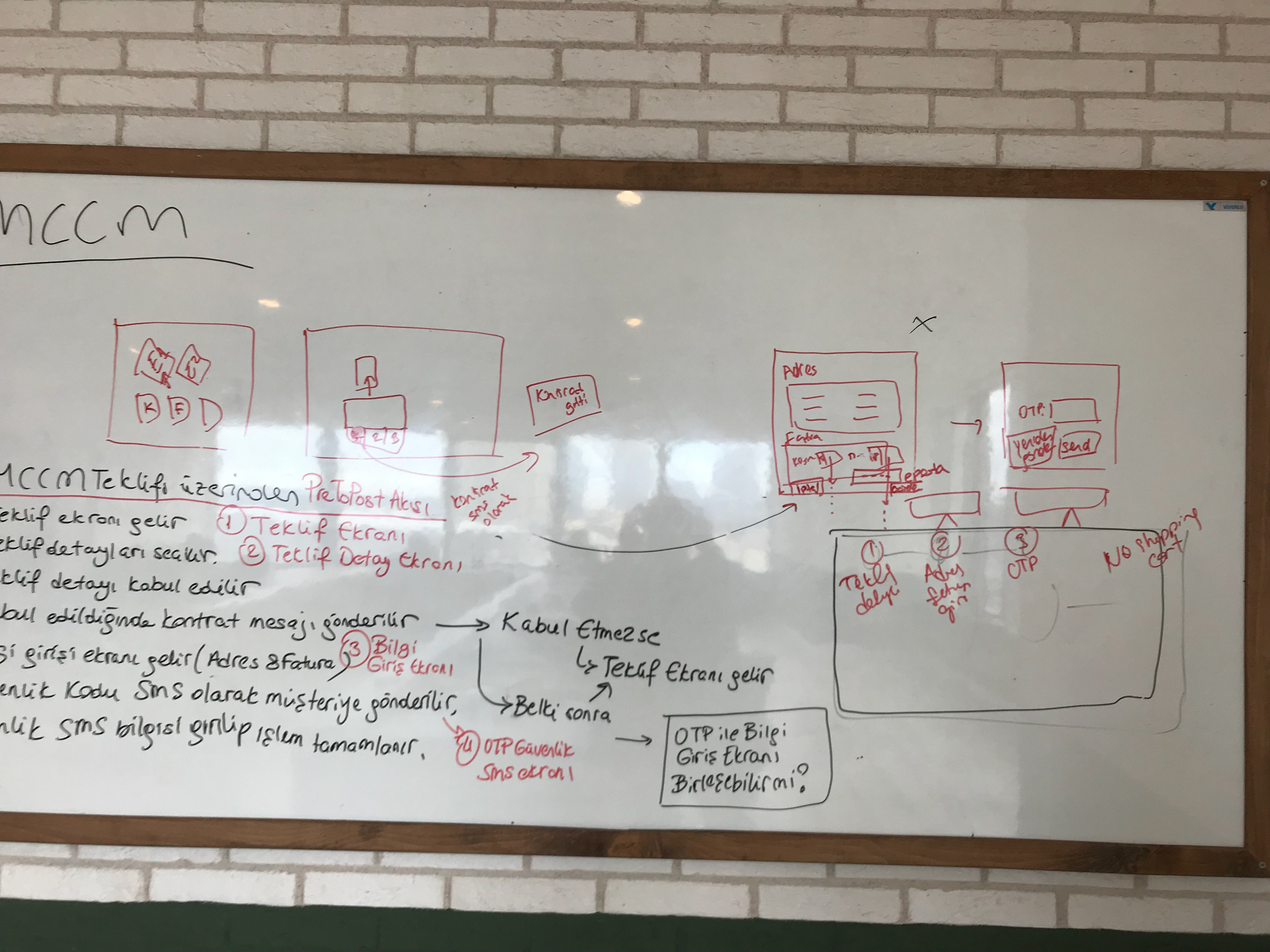
Some User Centered Design features;
1- Customer info header top on the layout for view some important info.
2- Maın, user menu and breadcrump line menu.
3- Most used menu as tab square on starting page. Sales bst offers cards on this page, too.
4- User sales performance monitoring dashboard and details.
5- Maximum two scroll. We don't like long page.
6- Every component redesigned for usablity. Form input fileds, tariff / invoice cards, shopping cart, steps header, card details.
7- Capture wizard for steps on same page.Useful and readable.
8- Most using menu ikon button on top logo header line.
9- All customer verification on same page.
10- Form edit and view on same page but not only editable filed design.
What I did?
- Setting goals and objectives.
- Stakeholder interviews
- Creating scenarios
- Creating user journeies and stories
- Creating site maps and user flow
- Conducting UX research and business process analysis
- Writig UX flow and sketch on board / notepad
- Low fidelity prototypes
- High fidelity prototypes
- Creating wireframe
- Final design
- Quality control after HTML - CSS coding
Many thanks my friends